🔢 Focus order
Common mistake
A common mistake is not managing focus order explicitly, which causes assistive technology users to experience unexpected jumps. Focus moves from one element to another in a way that does not follow the logical left-to-right, top-to-bottom reading order. Some elements may not be reachable at all. This leads to confusion and frustration for users of assistive technologies.
🎯 Relevant elements
This guideline applies to any screen or section with a non-trivial layout where the default focus order may not match the visual hierarchy:
- Navigation bars and bottom navigation
- Multi-column or grid-based layouts
- Overlay elements such as dialogs, bottom sheets, and modals
- Carousels and horizontal lists inside complex screens
- Elements which do not read from left-to-right by default, for example: an element that looks like a top 3 podium, with first place in the middle.
WCAG Guideline
This guideline is based on WCAG 2.2 - 1.3.2 Meaningful Sequence (Level A). When the sequence in which content is presented affects its meaning, the correct reading order must be programmatically determinable.
This also relates to WCAG 2.2 - 2.4.3 Focus Order (Level A). If a page can be navigated sequentially and the navigation sequences affect meaning or operation, focusable components must receive focus in an order that preserves meaning and operability.
It also relates to WCAG 2.2 — 2.4.11 Focus Not Obscured (Level AA). When a component receives keyboard focus, it must not be entirely hidden by author-created content such as sticky headers, bottom navigation bars, or overlays.
Solution
Wrap related groups of interactive widgets in a FocusTraversalGroup. This widget scopes focus traversal to the widgets inside it, ensuring that keyboard navigation stays logically ordered within each group and does not accidentally jump to elements outside the current context.
By default, Flutter uses ReadingOrderTraversalPolicy, which groups widgets into horizontal bands and traverses each band left-to-right. For most single-column layouts this is fine and no extra configuration is needed. FocusTraversalGroup is only needed when the default behaviour does not match the logical reading order of the screen.
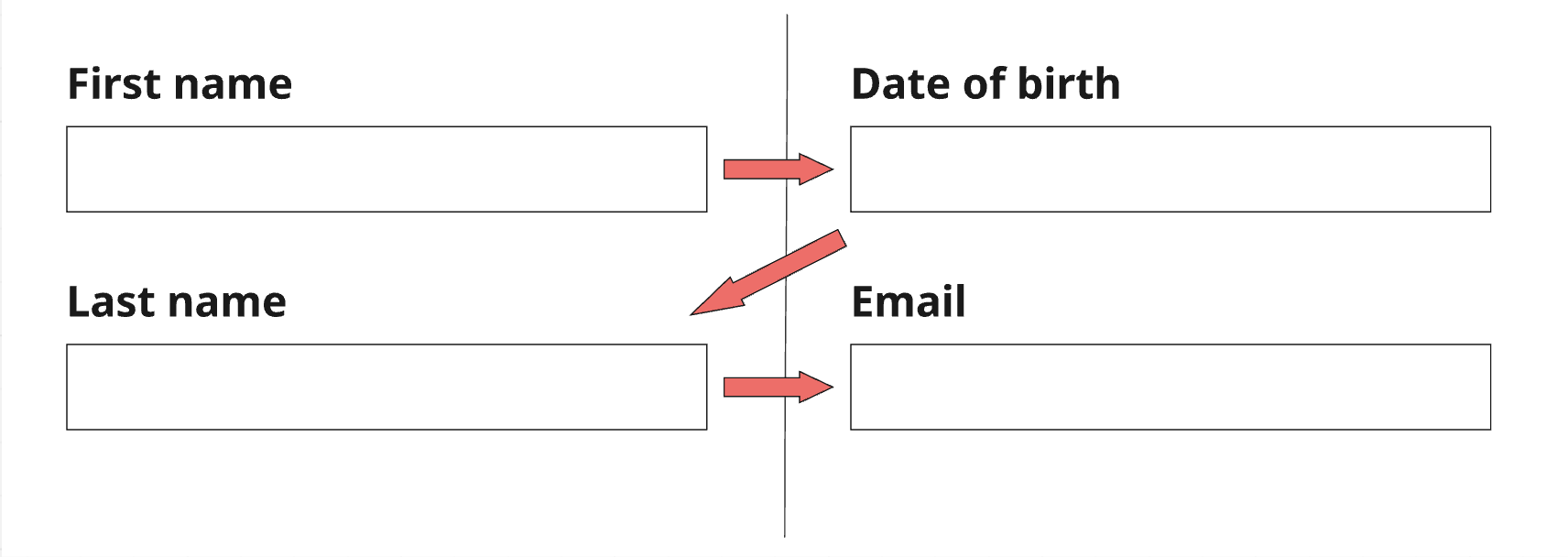
A concrete case where the default fails is a two-column form. Flutter’s band-based algorithm places widgets that share the same vertical band in the same focus group, so it traverses them row-by-row (A → C → B → D) instead of column-by-column (A → B → C → D):
// ❌ Don't - default traversal goes row-by-row: "Name" → "First name" →
// "Date of birth" → "Last name", which does not match the visual grouping
Row(
crossAxisAlignment: CrossAxisAlignment.start,
children: [
Column(children: [
TextField(decoration: InputDecoration(labelText: 'Name')), // A
TextField(decoration: InputDecoration(labelText: 'Date of birth')), // B
]),
Column(children: [
TextField(decoration: InputDecoration(labelText: 'First name')), // C
TextField(decoration: InputDecoration(labelText: 'Last name')), // D
]),
],
);
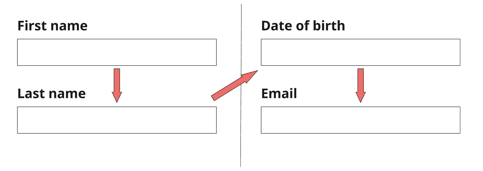
// ✅ Do - each column is a separate traversal group, so focus completes
// the left column (A → B) before moving to the right column (C → D)
Row(
crossAxisAlignment: CrossAxisAlignment.start,
children: [
FocusTraversalGroup(
child: Column(children: [
TextField(decoration: InputDecoration(labelText: 'Name')),
TextField(decoration: InputDecoration(labelText: 'Date of birth')),
]),
),
FocusTraversalGroup(
child: Column(children: [
TextField(decoration: InputDecoration(labelText: 'First name')),
TextField(decoration: InputDecoration(labelText: 'Last name')),
]),
),
],
);
| 👎 Don’t | 👍 Do |
|---|---|
 |  |
Custom traversal order for non-standard visual layouts
Some layouts are intentionally arranged in an order that does not match the default left-to-right, top-to-bottom reading order. An example is a podium element (1st place in the centre, 2nd on the left, 3rd on the right): visually the winner stands tallest in the middle, but logically focus should start at 1st, then move to 2nd, then 3rd - not left (2nd), centre (1st), right (3rd).
Use OrderedTraversalPolicy together with FocusTraversalOrder to assign an explicit sequence number to each element, overriding the visual position entirely.
// ❌ Don't - ReadingOrderTraversalPolicy reads left-to-right:
// focus lands on 2nd → 1st → 3rd, which is the wrong logical order
Row(
  mainAxisAlignment: MainAxisAlignment.spaceEvenly,
  children: [
    PodiumSpot(place: 2, height: 80),   // leftmost column
    PodiumSpot(place: 1, height: 120),  // centre column (tallest)
    PodiumSpot(place: 3, height: 60),   // rightmost column
  ],
);

// ✅ Do - OrderedTraversalPolicy respects the logical order: 1st → 2nd → 3rd
FocusTraversalGroup(
  policy: OrderedTraversalPolicy(),
  child: Row(
    mainAxisAlignment: MainAxisAlignment.spaceEvenly,
    children: [
      FocusTraversalOrder(
        order: const NumericFocusOrder(2), // 2nd in logical order
        child: PodiumSpot(place: 2, height: 80),
      ),
      FocusTraversalOrder(
        order: const NumericFocusOrder(1), // 1st in logical order
        child: PodiumSpot(place: 1, height: 120),
      ),
      FocusTraversalOrder(
        order: const NumericFocusOrder(3), // 3rd in logical order
        child: PodiumSpot(place: 3, height: 60),
      ),
    ],
  ),
);
NumericFocusOrder values are compared numerically; focus moves from the lowest number to the highest. The values do not need to be consecutive - you can use 1, 2, 3 or 10, 20, 30 to leave room for future items.
Focus not obscured by sticky elements
When a screen has a persistent header (SliverAppBar) or bottom navigation bar, a focused element that scrolls near those edges may be hidden behind them. Ensure focused elements scroll into view with enough padding to remain visible above sticky UI.
// ❌ Don't - focused item may scroll behind the bottom navigation bar
ListView.builder(
  itemBuilder: (context, index) => ListTile(title: Text('Item $index')),
);

// ✅ Do - add padding so focused items are never obscured by the
// bottom navigation bar (adjust the value to match your bar height)
ListView.builder(
  padding: const EdgeInsets.only(bottom: 80),
  itemBuilder: (context, index) => ListTile(title: Text('Item $index')),
);
For screens with a SliverAppBar, use ScrollPositionAlignmentPolicy.keepVisibleAtEnd or Scrollable.ensureVisible when focus changes to guarantee the focused widget is fully in the viewport.
Validation & Testing
See the Validation & Testing setup guide for tool configuration.
SemanticsDebugger
Enable SemanticsDebugger and navigate through the screen using a keyboard or swipe gestures. Verify that focus moves in the expected logical order — top-to-bottom within each column, then left-to-right between columns — rather than jumping between sections.
TalkBack & VoiceOver
Navigate through the screen using swipe gestures and confirm the announcement order matches the visual reading order. Pay particular attention to multi-column layouts, carousels, and screens with sticky headers or bottom navigation.
flutter_test
Use FocusTraversalGroup and FocusScope to assert traversal order in widget tests.
testWidgets('two-column form traverses left column before right column',
    (tester) async {
  final nodes = List.generate(4, (_) => FocusNode());

  await tester.pumpWidget(
    MaterialApp(
      home: Scaffold(
        body: Row(
          children: [
            FocusTraversalGroup(
              child: Column(children: [
                Focus(focusNode: nodes[0], child: const TextField()), // A
                Focus(focusNode: nodes[1], child: const TextField()), // B
              ]),
            ),
            FocusTraversalGroup(
              child: Column(children: [
                Focus(focusNode: nodes[2], child: const TextField()), // C
                Focus(focusNode: nodes[3], child: const TextField()), // D
              ]),
            ),
          ],
        ),
      ),
    ),
  );

  nodes[0].requestFocus();
  await tester.pump();
  expect(nodes[0].hasFocus, isTrue);

  // Tab to next: should move to B (same column), not C (next column)
  await tester.sendKeyEvent(LogicalKeyboardKey.tab);
  await tester.pump();
  expect(nodes[1].hasFocus, isTrue);
});